Finding Harmony in Duality: Redefining Mental Health Stigma

Overview
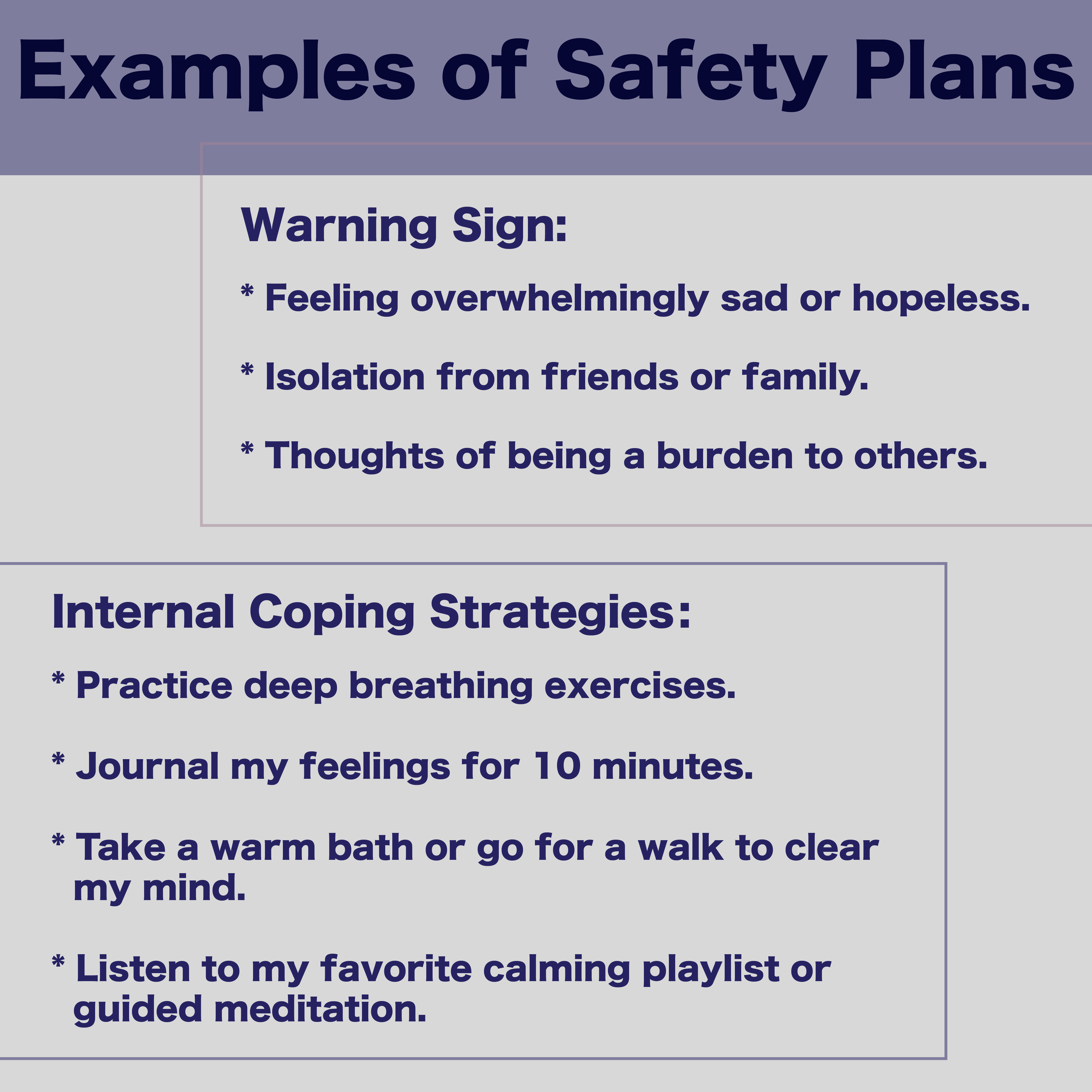
The Harmony in Duality campaign is a comprehensive awareness initiative designed to reduce stigma, foster understanding, and provide support for individuals living with bipolar disorder and their loved ones. The campaign aims to educate with empathy, highlighting the duality of mania and depression while showcasing the resilience of those living with bipolar disorder.
Goal
The campaign aimed to create a relatable, visually striking logo and accompanying social media posts to engage the target audience. The campaign's message was clear: bipolar disorder is a manageable condition, and understanding is the first step toward building supportive communities.
Skills
Visual Identity
Adobe Illustrator
Aftereffects
Design Approach
The logo design symbolizes the duality inherent in bipolar disorder through two contrasting yet harmonious elements. Inspired by yin-yang symbolism, the logo reflects balance and coexistence. The color palette includes calming tones to evoke a sense of peace, juxtaposed with dynamic hues to represent energy and emotion. This visual language guided the design of all social media materials. The color palette includes orange and blue, chosen to represent the manic and depressive states respectively, reflecting the contrasting yet interconnected experiences of bipolar disorder.
Version 1

Version 2 - Final

Research
Much research and experimentation were invested to ensure the campaign’s content was accurate, visually appealing, and impactful. I explored numerous design iterations for the social media posts, refining them to achieve the perfect balance of aesthetics and emotional resonance. This iterative process involved testing different layouts, typography, and color schemes to create posts that conveyed accurate information, captured attention and left a lasting impression.
Version 1
This initial version emerged from a spontaneous design process inspired by a discussion with my professor, who emphasized the importance of creating even when uncertain. It marked the first exploration of whether the campaign’s tone should lean toward serious or visually striking. Various layouts were tested in this phase.


Version 2
Building on the initial concept, I shifted toward a more serious tone. Researching existing bipolar awareness campaigns, I sought to align my designs with established visual standards while ensuring a unique identity for this project.


Version 3
To address the previous version’s muted color palette, I adopted bold hues—specifically orange and blue—to symbolize mania and depression. This change brought energy and emotional resonance to the posts.


Version 4
Inspired by bipolar artists, including Vincent van Gogh, I incorporated artistic influences to add depth and authenticity. This version celebrated the creativity and resilience often associated with those living with bipolar disorder.


Version 5
Recognizing the importance of optimizing for platform specifications, I explored Instagram’s larger post size and made bolder design choices to maximize visual impact and engagement.


Version 6
This iteration introduced a sense of discomfort and unpredictability through the use of dynamic lines, reflecting the lived experience of bipolar disorder. It was also the first version to integrate motion elements using After Effects, setting the stage for more immersive storytelling.


Experimentation
Once a strong foundation for static social media posts was established, I transitioned these designs into motion pieces using After Effects. Recognizing the challenges of holding attention in digital spaces, I leveraged motion graphics to enhance engagement and deepen the impact of the campaign’s message. The animations were designed to emphasize key points and create a dynamic experience for viewers. To align with user habits, I opted for a dark mode aesthetic, recognizing that people often watch videos at night, ensuring the design was visually comfortable and engaging in low-light environments.
Takeaways
This project reinforced the importance of thorough research, iterative design processes, and multimedia approaches in raising awareness about mental health. By combining visual storytelling with educational content and leveraging motion graphics to overcome attention barriers, the Harmony in Duality campaign successfully created a space for understanding and connection.